HOURS SAVED IN 12
MONTHS
800
Average rating on delivered projects
4.9/5
Number of finished projects
42
Background
By looking at the surgical implants and instruments used around the world today, you’d think that we’re all the same anatomically. And even though it’s now well understood that our bodies are as unique as our thoughts, surgeons still use the same standardized tool sets for each individual patient.
Episurf set out to challenge this. With new 3D-imaging and manufacturing technology, the company could adapt not only the implants, but also the actual tools used, to each patient’s specific anatomy. Hands down a technological breakthrough. And in collaboration with Klingit it was now time to design an equally sharp brand to catch the world’s attention.

“Thanks to Klingit, our brand today feels like
Pål Ryfors
a natural part of us, and something we are proud of.”
CEO
Solution
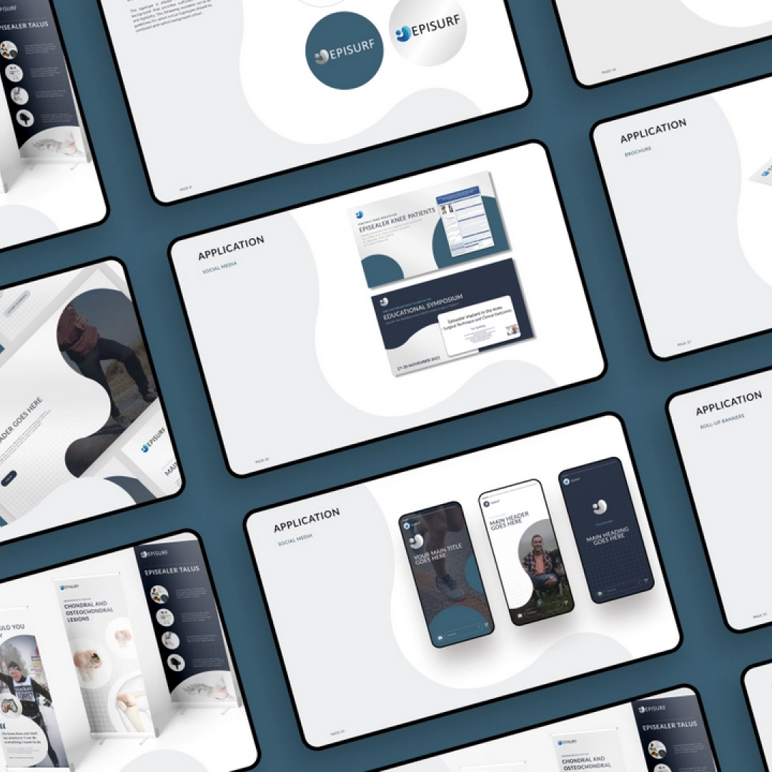
Episurf wanted to keep the core elements of their visual identity intact. This meant that we were looking at a renovation project: reworking and further developing colors, fonts, visual elements and logo. We also produced clear guidelines so that all elements together would consistently make up one unified brand.
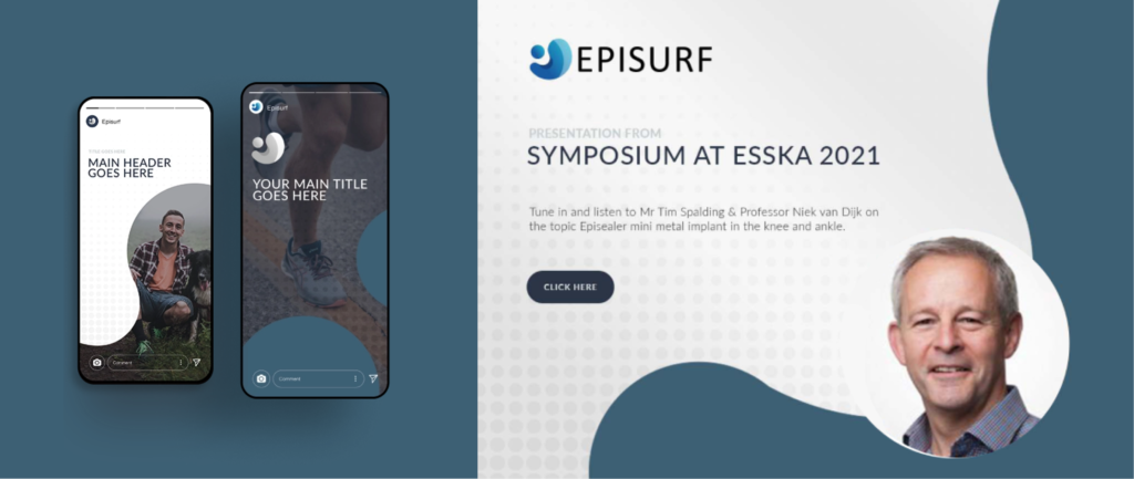
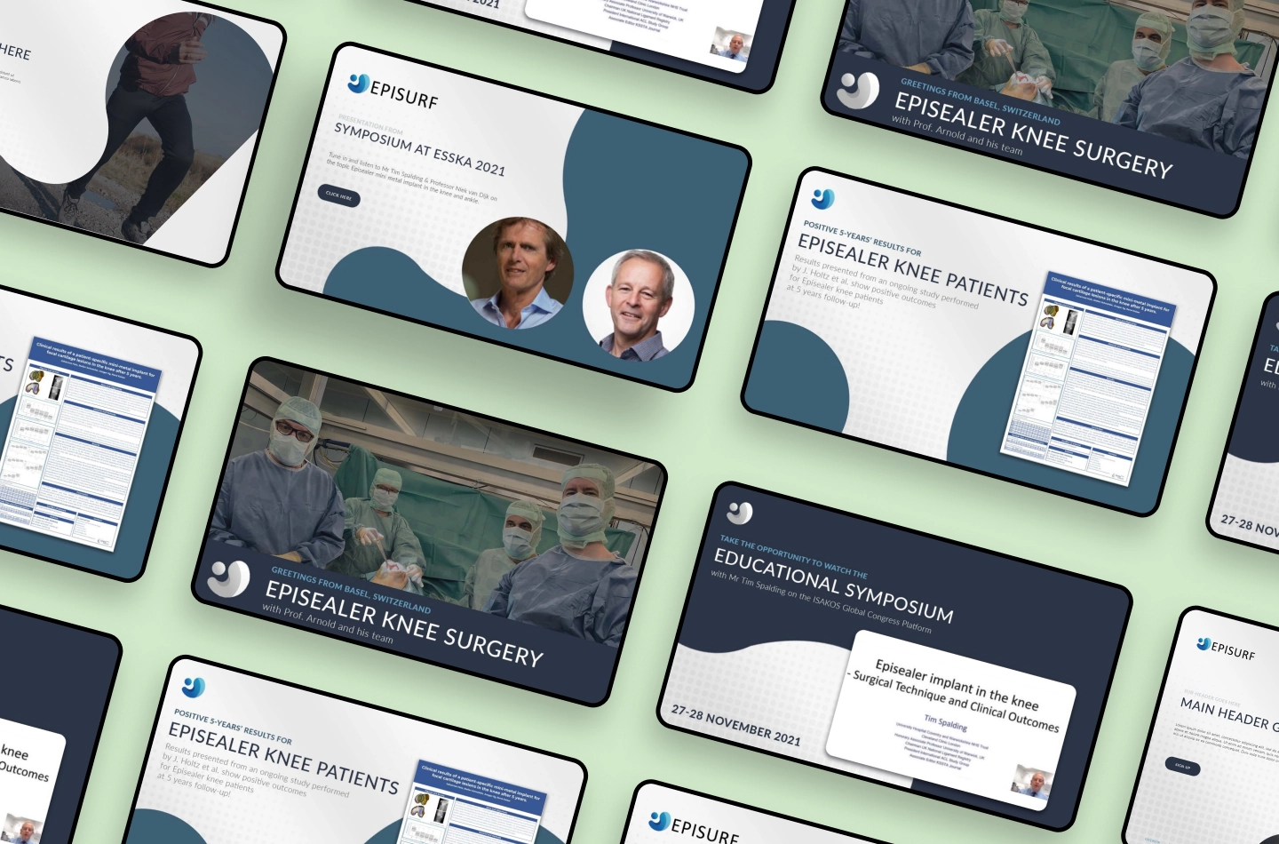
With a refurbished brand book in place, we also went ahead and did a few field tests, including ad templates, print roll-ups and presentations. Step by step, we made Episurf’s brand ready to see real action.
Result
Episurf now has a solid visual identity to lean on, along with clear, easy-to-use guidelines. Now they can confidently start rolling out their brand, knowing that it’ll look like the same innovative medical technology company, regardless of market and channel.
The collaboration with Klingit continues under the plan Production, which means we’ll be their go-to partner for churning out exciting, on-brand designs to grow their business — as well as their brand equity.
